9 Information Design Tips to Make You a Better Web Designer
Dec 3rd in Articles by Collis
It’s probably the least glamourous part of web design, but information design is by no means the least important. Locating and consuming information is the quintessential web task, far surpassing buying, playing and communicating, all of which include a good portion of information design themselves. How users find and then avail themselves of all that information is affected by how it is structured and presented. Thus every web designer should be equipped to make qualified and informed decisions on just how to do this.

Hello! I started PSDTUTS because years ago reading Photoshop tutorials was how I got into design. I hope the site helps and inspires others! You can find me on Twitter!
The 3 Components of Web Design Series
This article is part of a series on the three components of web design, here are links to the other articles (so far published)
1 – Be methodical
Information design is a problem that gets more and more complex the bigger the website. However even a small website will benefit from a methodical, step by step process to figure out how to order and organise the site’s content. Here are some simple steps you may wish to take:
-
- Understand the Site’s Content, Processes and Purpose
It’s pretty hard to organise a bunch of stuff if you don’t know what that stuff actually is. So your first task is to skim through the site’s content, processes and goals. A site’s content means copy, images, video and other assets you’ve been given or briefed on that needs to go into the site. A site’s processes are the tasks and workflows that users will need to complete to interact with a site. And the site’s goals refers to both the client’s goals and the user’s.
So for a simple restaurant example you might find that you have text for pages 1 through 20, you know that users will be attempting to complete some task such as making a reservation. You might also see that a user’s goals on the site are to find out what the restaurant serves, where it is located and whether there are tables, and then hopefully make a reservation. Finally the client’s goals might be to serve the user, but also to push them towards a set of specials they run.
- Prioritize and Look for User Paths
Once you’ve got a firm grasp of what’s going into the site, you can begin to prioritize information and figure out how users will traverse the site. What paths will they take to accomplish their goals? What pages are the most important? Which should be seen right up front and which are just supporting information?
Even with a simple example like our restaurant site, there are many ways of setting out the information. For example you might push specials straight away on the homepage, or you could tie them into the reservation process, or you might work them into the menus. Similarly you may find that given a client’s goals, you will have a different priority on page content. Maybe the client tells you that no-one is ever able to find this restaurant, so you need to make a How to Get Here page and give it a high priority.
- Organise the Information
With an understanding of what is going into the site, and a clear grasp of how the different elements relate to each other, how users will want to work through them, and how important different sections are, you can now organise the information for the site. This organising involves not just categorizing pages – for example figuring out that ‘about the company’ fits under an ‘about’ tab – but even questioning and rearranging the content you’ve been given. Sometimes you may find that it’s better to combine multiple pages, break up one long section, turn some text into a simpler diagramatical representation, or any number of other rearrangements.
Develop a sitemap or plan of how the information will site in a heirarchical way. Although sitemaps are usually just a set of boxes indicating pages, you can work in all sorts of extra information explaining how the site is going to be set up, including things like quick links from the homepage, how different sections might tie in together, and paths a user might take through a sitemap.
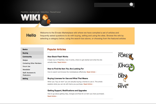
After realising there was so much information on the marketplaces, we now believe a wiki is the most effective way to organise it
2 – Think out of the Box
Sites with a reasonable amount of complexity can be rearranged and reorganized many different ways. One site that I’ve worked on organising and reorganising countless times is FlashDen. I’ve lost count of the number of times I’ve looked at that menu and rearranged it. In some instances we just move pages into different sets and groups so that they seem more logical, and in others we’ve introduced more out-of-the-box thinking.
For example some months ago the menu was becoming overly complex so we removed a whole heap of the more “fluffy” menu items and created a blog that now houses competitions, newsletters, subsite links and other pages that were cluttering up the menu.
Recently we’ve found we have many of what I call “stragglers” – that is pages without a home in the menu. From an information design point of view, stragglers are terrible – even I can’t remember how to get to some of them! The solution this time is to build a wiki system, pipe top level content into the menu behind the scenes, and then use the wiki to house deeper levels of information with its own search, tagging and categorization facilities.
The point of my experiences with FlashDen is that organising information doesn’t even necessarily have to be about putting it into menus and submenus. You may find that some information shouldn’t be on a site, or that it requires a subsite, or that you need to do something else altogether. With FlashDen I have the advantage that it’s been almost 3 years now that I’ve been looking at the content and still to this day I find new arrangements and solutions.
To be an effective information designer and to find the most optimal solutions often requires thinking out of the box. Of course saying “think outside of the box” is much easier to say than to do! Sometimes we are constrained in a box we can’t even see. Some time ago I heard of an experiment where a bunch of jumping bugs were placed in a glass box and over time learnt to jump only so high. When the glass lid was removed the bugs continued jumping the same, restricted height not even realising they could if they wished get out.
So how do you overcome a box you can’t see? Simple! With the help of others who aren’t restricted by the same issues you have. For complex information designs I will often ask other people for organisational ideas giving them only the raw problem and not my own permutations. Getting say a programmer’s ideas or a user’s views will often surprise you as their perspectives are completely different from your own and unhindered by the same set ways of thinking.
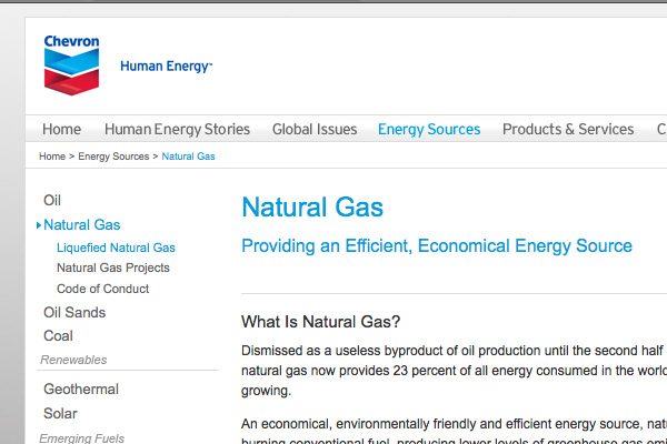
If anyone has a huge website, it has to be
Chevron. How would you organise all that information?
3 – Keep your structure balanced
When you do organise large sets of information, an obvious question that always arises is how deep or how wide should your navigation be. Depth refers to how many layers of categories and subcategories there are, while width is about how many of each level there are. The trick is to find the balance. If there are too many items on a single level – especially the top level – then you risk confusing the user. On the other hand if a user has to click many levels in, you risk losing them.
A good rule of thumb is to keep the number of options on a given level to 4 – 8. If you have 8 top level items, each with 8 subcategories, and each with 8 sub-subcategories, you’ll have enough space for a 512 page site. Of course rarely do things automatically balance out so well. So again you have to be careful that you don’t have a heavy side and a light side. For example, on a site with a couple hundred pages, if you put contact up on the top level somewhere, chances are it’s not going to have 8 subcategories with 8 sub-subcategories. It’s more likely that contact is going to be a pretty simple section – even for a complex site.
On the flip side if you don’t put something like contact at the top level, you may get a more balanced depth of information, however you risk not having an important user task completed because it’ll be hard to figure out how to find the contact information. A simple solution to this particular problem might be to add ‘quick links’ where you give a user a few options on the homepage to jump deeper into the structure without navigating the usual way.
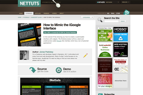
On
NETTUTS we decided to facilitate user habits with demo and source button placement.
4 – Design for Scanning, Skimming and Jumping
I don’t know about you, but it is seriously rare that I will ever fully read a webpage. Whether it’s to read instructions, terms and conditions, or just regular copy, most of the time I skim, scan and jump. Assuming I’m not the only one who does this, it makes sense to design pages to faciliate this way of consuming information.
Don’t wrap key information in bundles of text – highlight it. Don’t give users paragraphs on end – break them up with headings, subheadings, bullet points, diagrams, whatever it takes! Think about how a user will use your site and design it to facilitate their use.
A good example of designing for user consumption is on our sister site NETTUTS, a site that as most of you know, publishes tutorials about web development topics. Now on NETTUTS we noticed early on that most people, on first viewing a tutorial skip right through to the end, where they try to find a link to a demo and / or source code so they can decide if the tutorial is worth reading in the first place. Once we realised this, it was a simple matter to add special Demo and Source buttons and place them consistently at the top of the tutorials. This simple adjustment to match our design up to user consumption patterns has gotten us a lot of happy feedback.
 PatternTap
 is a good place to get ideas and see how other people design articles and textual information
5 – Design text that wants to be read
I’m not sure if I’m just getting older, or if spending all my time in front of a screen is just making me picky, but lately it really bugs me when I’m presented with text that doesn’t compel me to read it. The aim of a site design is usually to transmit information and most of that is written text, so focusing on displaying it well should be a priority.
Using too-small font sizes, low contrast between text and background colour, or badly using light text on a dark background, are all design sins that we’ve all been guilty of (me on many on an occasion!) But beyond these, there are other ways that your design can make the visitor actually read. Aim to design such that your layout focuses visitors on the copy and leads them in with titles, subheadings, demarcations, pullquotes, and other techniques for pulling the eye.

A simple example of guiding users through a site –
ThemeForest‘s 4 step guide
6 – Guide the User both across pages and through pages
Earlier I mentioned User Paths – that is set ways that users will tend to traverse a website. Many of these will come about simply by the way people behave, but with planning, you can choose how a user will be guided both through a single page and across multiple pages. Once you know specific paths you can work in visual guides and links to help them move along that path.
For example on FlashDen, when a new user arrives, it is our aim to get them to register, find files, deposit money and then buy those files. So we first give them a summary of the four step process on the homepage, then at each stop there are pointers to direct the user onto the next step. In our next redesign I’m hoping to make this path even more obvious as it’s essential to the site working as it should. Note that the path I’m describing is not 4 pages, but 4 tasks. For example finding files might involve the user looking at dozens of pages, but it’s one discrete task. User paths don’t need to be through set pages, they can just as easily encompass set tasks!
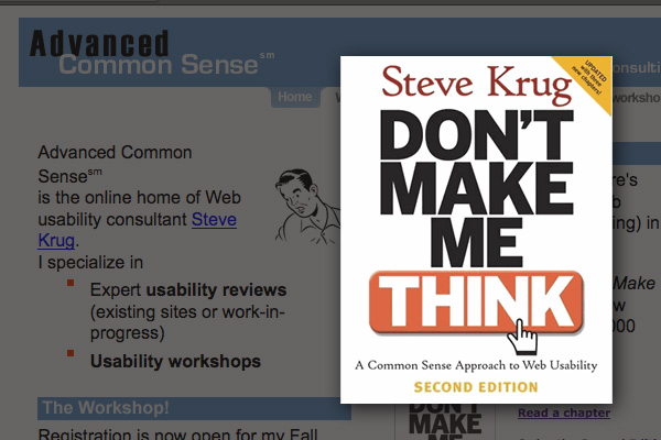
Steve Krug’s very worthwhile book!
7 – Don’t overcomplicate things
It should go without saying that simple is better for users than complicated. Nonetheless it’s all too easy to overcomplicate designs. I know that I often make things seem more complicated so that I have more visual elements on a page to work with (bad Collis, bad Collis!) Another overcomplication sin is using unnecessary words on buttons and calls to action. Steven Krug in his excellent book Don’t Make Me Think gives the example of a hypothetical employment site with a button that reads:
- Jobs
- Employment Opportunities
- Jobs-o-rama
One of these is clear, one is reasonably obvious, and one is – well who knows.

Information can be presented as more than just text!
8 – Visualize Information
As designers, we more than most, know the value of a good visual. And there are plenty of opportunities to diagram or visualize some data, concepts or information. This very article as you will remember begins with a very basic diagram of how interface design, information design and aesthetic design relate. These visuals not only break up text, but they are also more memorable and give you an opportunity to bring a page to life.
DoshDosh have an interesting article on information visualization, diagrams and what the author calls infographics that is worth checking out even if it’s only to see the brilliant graphic examples.

Analysing paths and goals has never been easier thanks to tools like Analytics
9 – Analyse your Information Design
Information design is one of those things that is hard to get right on the first attempt. So once you’ve built a site you should be analysing it to see how people use and digest the information, how they behave and where you can improve your design.
A neat tool in this regard is Google Analytics. For example where I mentioned User Paths earlier, Analytics lets you track paths through pages using the Goals feature. You set up a sequence of pages and Analytics will report the %’s of visitors who make it through (and by extension click away) at each point.
Another Analytics feature you can use is search term tracking which lets you see what users are searching for on your own site’s search field. Knowing what people are looking for tells you what information needs to be more readily available!
Do you have any Information Design Tips?
Share your own tips and ideas about good information design in the comments!
Update: Check out this article on AListApart
By some odd coincidence AListApart has published a neat article about Information Architecture today – Flexible Fuel: Educating the Client on IA. Go information design 🙂
 Part of Web Design Week
This week our sister site ThemeForest launched a whole new category of items to sell that are particularly relevant to PSDTUTS readers – namely Photoshop Templates. The new category means you can now design and sell Photoshop designs, as well as regular Web Templates and WordPress themes to earn a side or even full income. And on the flip side if you’re coming up short on inspiration, you can get a kickstart by grabbing a PSD design from ThemeForest. So to give the new category the launch it deserves, all this week I’ll be bringing you articles and tutorials on web design as part of our PSDTUTS Web Design Week.
Tags: css tricks, Design Tips, Photoshop to XHTML and CSS, Usability, web design


 CSS Circle